Article Preview Card
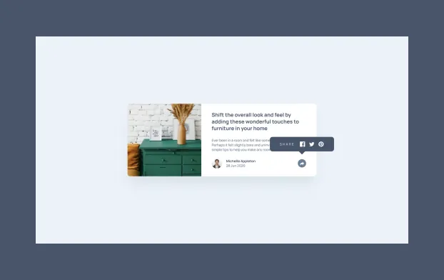
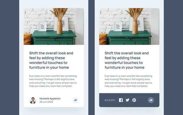
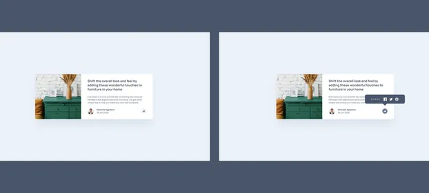
The publisher wanted a share control on its article previews, and the design draws it twice: a tooltip on desktop, a bar that takes over the footer on phones. I built both from one component and one state.
Visit Website, Article Preview CardProject Background
The publisher came with one card: a photograph, a headline, an intro paragraph, the author and the date, and a share control that opens. That control is drawn twice, a tooltip on desktop and a bar replacing the byline row on phones, so one component carries both. Three greys missed the contrast bar, and one sits on white in one place and on the dark panel in another, so a design token became two. Scope ran from 320 up, and the four Lighthouse categories each come back at 100.
Static Previews